Art Direction Changes How A Game Feels To Play
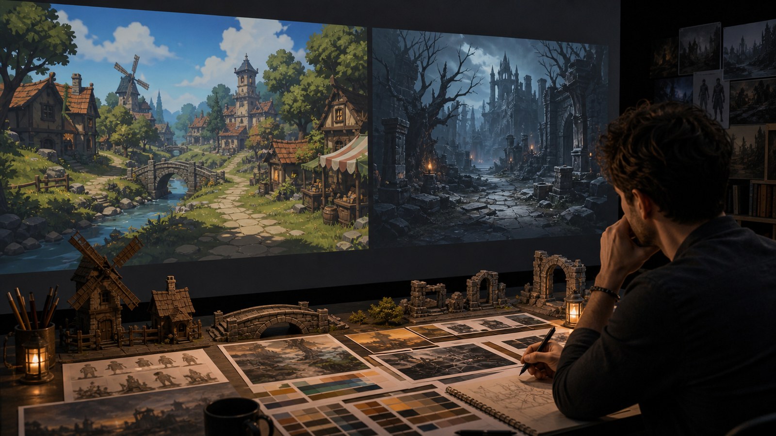
Visual style in game design is more than surface identity. It changes how players feel, where they look, what they understand, and what they remember. A bright stylized village can make exploration feel safe before a single line of dialogue appears. A cold angular ruin can make players slow down, listen, and expect danger. A soft character silhouette can invite empathy, while a harsh one can create distance or threat. Art direction works on the player constantly, often before they notice it. It frames the world’s emotional temperature, clarifies interactive information, controls attention, and teaches players what kind of experience they are entering. Strong visual style does not simply decorate good design. It helps the design communicate. When art direction and gameplay agree, the game feels more readable, more memorable, and more intentional.
A: Start with one small project that can be finished and reviewed.
A: Add detail after the main structure, scale, and read are working.
A: Use enough to answer form, material, style, and context questions.
A: Helpful feedback points to a clear problem and a possible next change.
A: Keep a must-have list and move extra ideas into a later version.
A: Clarity, lighting, scale, and a view that shows the strongest choices.
A: Use them when they solve a real problem, not because they look impressive.
A: Save versions before big changes and at every stable milestone.
A: Return to the original promise and fix the largest weakness first.
A: It is complete when it meets the goal clearly enough to share, play, display, or learn from.
Style Sets Expectations Before Mechanics Speak
Players begin reading a game before they understand its rules. The first environment, character pose, color palette, lighting setup, and interface tone all suggest what kind of experience is coming. A game with rounded shapes and soft animation may invite experimentation. A game with narrow corridors and harsh contrast may encourage caution. These expectations affect how players approach the first mechanic.
Good art direction uses this early reading intentionally. If the game is about playful discovery, the style should not accidentally communicate punishment and dread. If the game is about survival pressure, the world should not feel visually weightless unless that contrast is part of the point. Style is a promise, and players notice when the promise and experience disagree.
This is why visual style belongs in design conversations. It shapes player behavior before tutorials, tooltips, or narrative exposition arrive.
Readability Is An Emotional Feature
Readability is often discussed as if it were separate from mood, but it is deeply emotional. When players understand what they are seeing, they feel more confident and present. When they cannot identify threats, paths, or objectives, frustration rises even if the art is technically impressive. Clarity lets players trust the game.
Art direction can create clarity without flattening the world. A horror game can be readable and still frightening. A cozy game can be readable without becoming bland. A tactical game can be information-rich without becoming visually sterile. The question is not whether style or clarity wins; the question is how style carries clarity. Players rarely praise readability directly, but they feel its absence immediately. Strong visual style makes important information feel like part of the world rather than an overlay fighting the art.
Shape Language Teaches Players How To Feel
Shapes communicate faster than detail. Rounded houses, squat creatures, long thin towers, jagged weapons, heavy doors, and flowing costumes all create emotional impressions. Players may not analyze those impressions consciously, but they respond to them. A friendly world and a hostile world can use the same polygon count and still feel completely different because their shapes speak different languages.
Shape language is especially important for characters and enemies. A large top-heavy creature suggests different movement and threat than a thin angular one. A support character with open posture communicates differently from one wrapped in hard closed forms. These choices help players understand role and temperament before reading abilities.
The strongest games repeat shape logic across scales. Architecture, props, characters, and effects feel related because they share visual grammar. That grammar becomes part of the player’s memory of the game.
Color Controls Pace And Attention
Color is one of art direction’s strongest attention tools. A reserved accent can guide players toward a door, objective, collectible, hazard, or character. A sudden palette shift can mark danger, safety, dream, corruption, or revelation. Region palettes can help players remember where they have been and what kind of choices belong there.
Poor color planning creates competition. If every object is saturated, nothing is important. If danger uses the same color as reward, players hesitate. If UI colors clash with world colors, the screen feels noisy. Color needs hierarchy as much as beauty. Accessibility belongs in this discussion from the beginning. A palette can be emotionally strong and still fail players who cannot distinguish key signals. Testing color with real gameplay and accessibility filters protects both mood and usability.
Materials Make Worlds Feel Touchable
Material design shapes how believable a world feels. Stone, cloth, glass, metal, wood, bone, plastic, moss, dust, and water all carry expectations about weight, age, sound, and use. A fantasy world with consistent material logic feels more grounded, even when it contains impossible creatures or magic. A science-fiction world with careless materials can feel artificial even if the models are detailed.
Materials also tell story. Polished floors suggest care or status. Rust suggests neglect, time, or exposure. Patched fabric suggests use and repair. Cracked ceramic, scorched metal, and damp stone all imply histories. Art direction decides whether these material stories belong to the game’s emotional tone.
Players may not name material rules, but they use them to understand the world. Touchable style makes environments feel less like backgrounds and more like places.
Visual Style Shapes Memory
Players remember games through images: a skyline, enemy outline, color relationship, UI rhythm, lighting mood, or object silhouette. Strong art direction gives players memory hooks. It creates scenes and forms that can be recognized in a thumbnail, fan drawing, trailer, or mental image years later.
Memory comes from consistency and contrast. If everything looks equally important, nothing sticks. If the game repeats a few meaningful motifs and breaks them at key moments, players remember both the pattern and the exception. A visual style becomes iconic when it is disciplined enough to be recognized and flexible enough to surprise. This is why art direction is not superficial. It determines what remains in the player’s imagination after the session ends.
Test Style With Real Player Tasks
A style review should include real tasks: find the door, identify the enemy, follow the path, understand the reward, read the UI, survive the effect, remember the landmark. Beautiful screenshots are useful, but they do not prove the style works under pressure. Players experience style while trying to do things.
Testing may reveal that a dark area needs stronger silhouettes, a bright area needs calmer UI, or an effect needs a cleaner edge. These are not failures of the art; they are the normal process of turning style into experience. The best teams treat visual feedback as design feedback.
When art direction supports emotion, clarity, and action at once, the game feels whole. Players do not see separate departments. They see a world that communicates with one voice.
Art Direction Teaches The Rules Of The World
Players learn from repetition. If climbable surfaces share a material rhythm, players notice. If dangerous magic always bends light in a particular way, players learn caution. If safe spaces use warmer pools of light and softer silhouettes, players begin to feel relief before reading any prompt. Art direction can become a teaching system when it is consistent enough to trust.
This teaching should be subtle but reliable. When visual cues change randomly, players stop believing them. When cues are too obvious, the world can feel artificial. The strongest approach is to make information feel like part of the environment’s natural language.
Style Can Change Player Tempo
Visual style affects how quickly players move. Open bright compositions invite momentum. Dense shadowed spaces slow players down. Large readable shapes support fast action, while intricate rooms invite inspection. Even before mechanics change, art direction can make players rush, pause, scan, hide, or explore.
Designers can use this tempo control deliberately. A quiet room after a chaotic fight gives players time to breathe. A narrow red-lit corridor before a boss can build tension. A sudden colorful vista after a gray route can create reward. Style shapes pacing because it changes the player’s body language.
This is especially important when the game changes modes. Combat, exploration, dialogue, crafting, menus, and cinematic moments may all need slightly different visual priorities. Good art direction lets those modes shift without making the game feel fragmented.
Interface Style Is Part Of The Experience
UI can either reinforce the game’s visual identity or fight it. A fantasy game with sterile menus may feel disconnected. A tactical game with overly decorative panels may slow comprehension. Interface style needs to match the game’s tone while staying readable under pressure. It is part of art direction, not an afterthought.
The best UI choices echo the world lightly. Icon shapes, motion timing, color priorities, and sound feedback can feel related to the game without burying information under ornament. Players should feel the interface belongs, then forget it is there because it works.
A Strong Style Supports Marketing Honesty
Screenshots and trailers carry the visual promise of the game. If art direction is clear, marketing becomes more honest and more memorable. Players can understand the tone quickly: cozy building, tense survival, elegant strategy, surreal exploration, or chaotic action. The style tells them what emotional space they are entering.
When the in-game style and marketing style diverge, players feel misled. A trailer may look more polished, darker, brighter, or more dramatic than the actual game. Consistent art direction helps the public image and player experience support each other instead of competing.
Teams should watch players, not only screenshots. If players miss the objective, misread an enemy, or ignore a beautiful space, the style may not be supporting the intended experience. Observation keeps art direction connected to play.
Use Contrast To Create Emotional Turns
Player experience becomes richer when visual style changes at the right moments. A safe hub can make a dangerous cave feel colder. A bright field can make a ruined fortress feel heavier. A clean interface can make a corrupted system effect feel invasive. Contrast gives the player emotional turns, and those turns make progress feel meaningful.
Contrast only works when the baseline is clear. If the entire game is visually loud, the big moment has nowhere to rise. If every region changes style completely, the player loses a sense of identity. Art direction needs enough consistency for contrast to register as intentional.
Designers and artists can plan these turns together. A story reveal, new mechanic, boss encounter, or major region transition can all be supported by shifts in palette, scale, material, motion, and density.
A successful style becomes part of the player’s emotional vocabulary. They learn what safety looks like, what danger looks like, what discovery looks like, and what change looks like. That vocabulary helps the game speak quickly and quietly.
Art direction also shapes how forgiving the experience feels. A readable style can make difficult encounters feel fair because players understand what hurt them, where safety is, and what changed. A confusing style can make even simple play feel hostile. This is why visual style should be judged partly by player confidence, not only by beauty.
When style gives players confidence, they take bolder actions. They notice opportunities faster, recover from mistakes sooner, and remember the world more clearly.
That confidence is one of style’s quietest but most valuable effects.
Make Style Serve Player Memory
The final value of visual style is not only what appears on screen. It is what players carry away: the color of a safe room, the outline of an enemy, the look of a storm, the glow of a reward, the shape of a city. Art direction shapes those memories by deciding what gets repeated, what gets emphasized, and what gets saved for rare moments.