Multiplayer Characters Must Be Memorable And Fair
Character design for multiplayer games carries pressure that single-player character design often does not. Each character needs a strong identity, but that identity must remain readable in motion, from distance, under effects, and against other players. A design that looks exciting in isolation can become a problem if its silhouette resembles another role, if its ability effects hide counterplay, or if a cosmetic skin makes the character harder to recognize. Multiplayer characters live inside a shared competitive space. They must communicate personality, power, team affiliation, threat, and vulnerability quickly enough for other players to respond. The best designs make uniqueness and balance support each other. A clear silhouette helps the character feel iconic, but it also helps opponents understand what is happening. Distinct animation gives the character charm, but it also signals timing. Visual clarity is not the enemy of style; it is what lets style function during play.
A: Start with one small project that can be finished and reviewed.
A: Add detail after the main structure, scale, and read are working.
A: Use enough to answer form, material, style, and context questions.
A: Helpful feedback points to a clear problem and a possible next change.
A: Keep a must-have list and move extra ideas into a later version.
A: Clarity, lighting, scale, and a view that shows the strongest choices.
A: Use them when they solve a real problem, not because they look impressive.
A: Save versions before big changes and at every stable milestone.
A: Return to the original promise and fix the largest weakness first.
A: It is complete when it meets the goal clearly enough to share, play, display, or learn from.
Design The Roster Before The Individual Hero
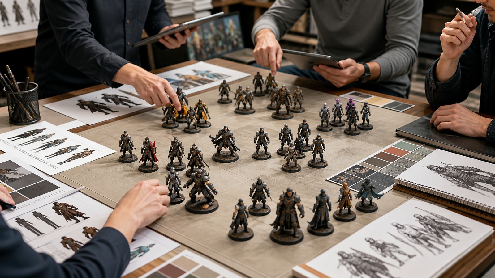
Multiplayer character design should begin with the roster map. A single character can look excellent and still damage the game if it occupies visual territory already claimed by another role. Teams should compare silhouettes, body proportions, weapons, movement speed, color accents, faction motifs, and ability effects across the full lineup before approving a new design.
Roster planning also protects future growth. If the first wave of characters uses every obvious shape language, later additions may feel forced or repetitive. Leaving open visual territory is a production strategy as much as a creative one. It gives designers room to introduce new roles, counters, and personalities without confusing players.
The roster view should include default characters and major cosmetics. A skin line that looks stylish in marketing art can create problems if several characters suddenly share cloaks, helmets, or glowing outlines. Multiplayer games need identity systems that scale.
Make Silhouette Serve Both Fantasy And Counterplay
A strong silhouette gives a character instant presence. In multiplayer, it also gives opponents information. A broad shield, tall staff, hunched creature shape, hovering body, or oversized weapon can signal role before the match fully begins. Players learn to react because the design teaches them what kind of threat or support they are seeing.
Silhouette should remain readable under motion and partial occlusion. Players may see only a shoulder behind cover, a weapon around a corner, or a shape through effects. If the character’s identity depends on small costume details, recognition will fail during real play. Counterplay benefits from this clarity. When players understand who they are facing, losses feel more fair. They can anticipate range, mobility, durability, or ability timing. A character that surprises through strategy is exciting; a character that surprises because the visuals were unclear becomes frustrating.
Connect Ability Language To Character Identity
Abilities should look as if they belong to the character using them. A precise sniper, chaotic brawler, protective healer, and area-control tactician should not share the same visual energy. Shape, color, timing, sound, and animation can all reinforce identity while communicating gameplay function.
The most important ability moments are startup, impact, area, duration, and recovery. Players need to see when danger begins, where it applies, how long it lasts, and when the user is vulnerable again. Visual effects that hide these beats may look impressive in trailers but weaken match trust.
Good ability language can become part of the character’s appeal. Players remember the windup pose, the flash of a shield, the arc of a projectile, or the sound of a support burst. Those signals become emotional as well as mechanical because they are tied to repeated play experience.
Treat Skins As Extensions, Not Disguises
Cosmetics are valuable in multiplayer games, but they must respect the character’s core identity. A skin can change theme, material, color mood, or fantasy, yet the player should still recognize the character quickly. If a skin makes one character resemble another, the cosmetic has crossed from expression into confusion.
Skin rules should be written early. Teams can define protected elements such as weapon outline, head shape, ability color family, posture, and major proportions. These rules do not prevent creativity; they clarify where creativity can safely happen. Artists can push materials, patterns, animation flourishes, and thematic props without breaking competitive readability. Competitive modes may need stricter boundaries than casual modes, but the ideal is to make every skin readable everywhere. Players should not feel that visual monetization creates unfairness. Trust is part of long-term multiplayer health.
Balance Visual Impact Against Mechanical Impact
Players read power through visuals. If a small attack produces a massive explosion, it may feel unfair when the damage is low or confusing when other effects matter more. If a dangerous ability looks quiet, players may blame the game for not warning them. Visual scale should match mechanical importance.
This does not mean every effect must be literal. Stylization is welcome, but the hierarchy needs honesty. A high-impact ability should have a stronger startup and clearer area than a minor poke. A defensive field should not look like an enemy damage zone. A healing effect should communicate support without hiding threats.
Teams should review ability visuals during balance passes. When damage, radius, cooldown, or function changes, the effect may need adjustment too. Visual balance and numerical balance are connected because both shape player expectation.
Test Recognition Under Real Match Pressure
Character approval should include stressful scenarios. A design that reads in a turntable viewer may fail in a crowded objective fight with particles, camera shake, UI, teammate outlines, and map lighting. Teams should watch real match footage and ask whether players identify characters before decisions are required.
Quick-recognition tests are useful. Show players short clips or still frames and ask who they saw, what ability started, and where the threat came from. Confusion patterns reveal where silhouette, color, effect, or animation needs strengthening. These tests are especially important for new players, who do not yet have deep roster knowledge. Broadcast and streaming views matter too. Multiplayer games often live through clips, tournaments, and shared moments. Clear characters make matches more watchable, which helps the game’s community understand and celebrate what happened.
Let Uniqueness Come From Coherent Contrast
A unique multiplayer character is not just louder than the rest. Uniqueness comes from coherent contrast: a shape no one else owns, an animation rhythm that matches the role, a personality that fits the mechanics, and ability effects that players can read quickly. The design should feel unmistakable without demanding extra mental effort.
Balance depends on this coherence. Players should be able to recognize a character, understand the likely threat, and respond through skill. When visuals support that loop, strong character identity makes the game feel fairer, not less competitive.
The best multiplayer rosters become languages players learn. A shoulder shape, a weapon angle, a footstep sound, or a burst of color can communicate instantly. Character design succeeds when those signals are stylish, memorable, and honest at the same time.
Give Opponents Honest Information
A multiplayer character is partly designed for the person controlling it and partly for the people playing against it. The opponent needs honest information about threat, range, timing, and vulnerability. If the character’s fantasy depends on being unreadable, the design may create short-term surprise but long-term frustration.
Honest information can still be stylish. A dramatic windup, distinctive sound, glowing weapon edge, or body-language shift can make an attack exciting while giving opponents a chance to react. Fair warning often makes a powerful move feel more satisfying because both sides understand the stakes.
Separate Personality From Visual Noise
Multiplayer rosters often chase personality through more detail, brighter effects, or louder silhouettes. That can work for a single hero reveal, but it becomes exhausting when every character competes for attention during a match. Personality should come from distinct choices, not constant noise.
A quiet character can be memorable through controlled motion, unusual posture, restrained color, or a precise ability shape. A loud character can work if the loudness is organized and tied to gameplay importance. The issue is not intensity; it is hierarchy.
When reviewing a roster, teams should ask which characters demand attention at each moment and why. Visual attention is a limited resource in multiplayer design, and spending it carelessly can make the match harder to read.
Patch Clarity Alongside Balance
Balance patches often adjust numbers while leaving visuals unchanged. That can create mismatches. If an ability’s radius shrinks, its effect shape may need to shrink. If a character gains a stronger defensive role, teammates may need better visual confirmation. If a projectile becomes slower, its trail and timing may need to support the new rhythm.
Players experience balance through perception as well as math. A technically fair ability can still feel unfair if the warning is weak. A weak ability can feel oppressive if the effect looks enormous. Visual updates should be part of the same conversation as cooldowns, damage, range, and mobility. Treating clarity as patchable keeps the game healthier over time. New maps, skins, modes, and roster additions can all change how readable a character feels, even if the character’s core model never changes.
Design For New Players And Experts At Once
New players and expert players read multiplayer characters differently. New players need broad signals: role, threat, team, and basic ability type. Experts notice timing windows, matchup cues, animation cancels, and small differences between skins. A strong design supports both audiences without splitting into two visual languages.
The broad read should come first. A newcomer should understand that a character is fast, defensive, supportive, dangerous up close, or threatening at range before learning advanced details. Expert signals can then live inside animation timing, effect edges, audio accents, and stance changes. This layered readability rewards mastery without abandoning accessibility.
When a character only makes sense to veterans, the roster feels intimidating. When a character has no expert-level nuance, it may feel shallow over time. Multiplayer design works best when the same visual identity scales with player knowledge.
This is why multiplayer character reviews should include art, design, animation, audio, accessibility, competitive balance, and player research together. Each group sees a different risk. An artist may see a weak silhouette, a designer may see misleading threat language, an accessibility reviewer may see color confusion, and a balance designer may see an ability whose visual promise no longer matches its numbers. The character becomes stronger when those concerns are resolved as one experience rather than separate checklists.
Teams should also listen closely to the language players use after matches. If players describe deaths as cheap, invisible, impossible to read, or visually overwhelming, the issue may not be balance alone. It may be a character design problem expressed through player frustration. Clearer silhouettes, cleaner effects, better audio cues, or stricter skin rules can sometimes improve trust as much as number changes. Multiplayer characters are part of the competitive contract, and that contract depends on players believing the screen told them the truth.
A healthy roster gives players confidence that they lost or won because of decisions, coordination, mastery, and counterplay. Character design cannot create that trust alone, but it can damage it quickly when recognition fails. Clear design keeps competition legible. Distinct design keeps the roster exciting. Balance depends on both forces working together every time a match begins.
Over time, players learn the roster as a set of readable promises. They know which shapes demand caution, which colors signal support, and which animations create opportunity. That shared language makes matches faster, fairer, and more satisfying.