Mobile Characters Must Read Fast And Run Smoothly
Designing game characters for mobile is a balancing act between expression and efficiency. The character needs to look appealing on a small screen, animate clearly under touch controls, load quickly, and perform well across a wide range of devices. Optimization does not have to mean stripping away all personality. In fact, the strongest mobile characters often succeed because their shapes, colors, gestures, and costumes are more deliberate than high-detail designs. Every element must earn its place. A readable silhouette can do more work than a cluster of tiny accessories. A strong color accent can communicate role better than a complicated material stack. A simple facial expression can carry emotion more reliably than a dense sculpt that disappears at gameplay distance. Mobile character design is not lesser character design; it is character design under sharper constraints.
A: Start with one small project that can be finished and reviewed.
A: Add detail after the main structure, scale, and read are working.
A: Use enough to answer form, material, style, and context questions.
A: Helpful feedback points to a clear problem and a possible next change.
A: Keep a must-have list and move extra ideas into a later version.
A: Clarity, lighting, scale, and a view that shows the strongest choices.
A: Use them when they solve a real problem, not because they look impressive.
A: Save versions before big changes and at every stable milestone.
A: Return to the original promise and fix the largest weakness first.
A: It is complete when it meets the goal clearly enough to share, play, display, or learn from.
Design From Gameplay Distance First
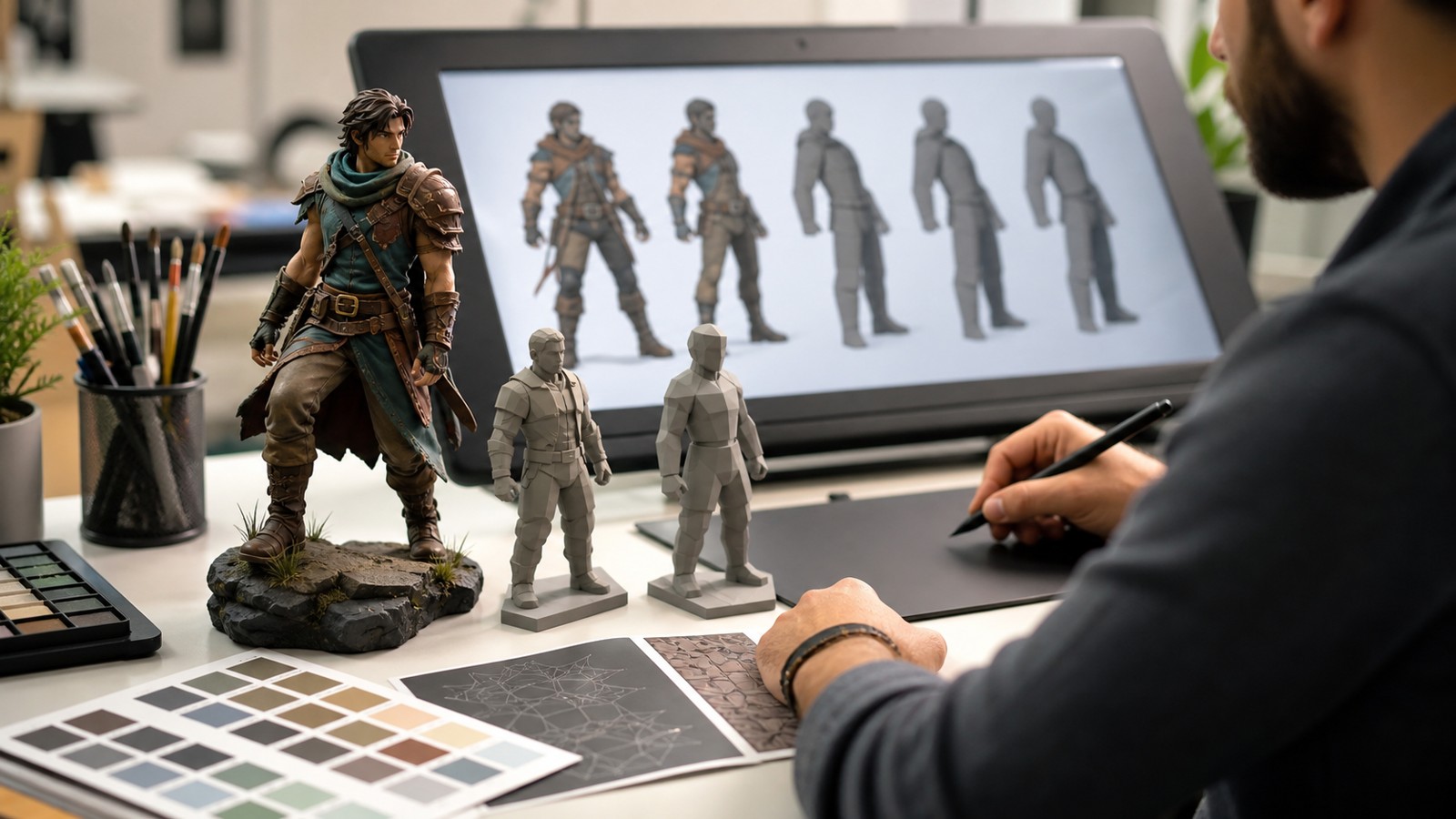
Mobile character work should begin with the camera the player uses most often. A sculpt that looks impressive in a close render may become unreadable when it is three centimeters tall on a phone screen. The first design pass should test silhouette, color, pose, and role from actual gameplay distance. If the character cannot be recognized there, adding detail will not solve the core problem.
This does not mean close-up quality is unimportant. Many mobile games show characters in menus, upgrade screens, dialogue, or store previews. The challenge is hierarchy. The design must read in gameplay first, then reward closer inspection with texture, expression, and polish. When the order is reversed, teams often spend time on details that players rarely perceive.
A useful test is to shrink the character to several small sizes and view it against real backgrounds. If players can still identify role, faction, and emotional tone, the design has a strong foundation. If it collapses into noise, the team should adjust shape and contrast before optimizing polygons or textures.
Optimize Around Identity, Not Against It
Optimization becomes damaging when teams remove the very features that make a character memorable. The smarter approach is to identify the character’s identity anchors and protect them. A curved horn shape, oversized gloves, bright scarf, asymmetrical weapon, or unusual posture might carry more recognition than thousands of surface details. Those anchors should survive every performance pass.
Once anchors are clear, the rest of the asset can be simplified with confidence. Geometry can be reduced on hidden areas, texture resolution can be concentrated on faces and focal props, and materials can be shared where the player will not notice a loss. The goal is not maximum reduction. The goal is efficient expression. This mindset also helps conversations between artists and technical teams. Instead of arguing broadly about quality, they can ask which elements serve recognition, which serve polish, and which are expensive decoration. That clarity leads to better compromises.
Use Silhouette And Color As Gameplay Tools
Mobile screens reward bold design language. A character with a distinct outline and disciplined color palette will usually outperform one covered in tiny high-resolution ornaments. Silhouette tells players who the character is before they process detail. Color helps them sort allies, enemies, abilities, rarity, and threat level during fast action.
Strong mobile silhouettes often exaggerate proportions. A healer might have a tall staff and open posture. A tank might use a broad stance and heavy upper-body shape. A quick attacker might lean forward with sharper angles. These choices are not only stylistic; they help players make decisions under pressure.
Color should be managed across the whole roster. If too many characters share the same accent placement or value range, recognition suffers. Teams should review characters together, not only as isolated assets. The roster view reveals whether each design owns a clear visual lane.
Keep Animation Clear Under Touch Controls
Mobile players often cover part of the screen with their hands, react in short sessions, and play under varied lighting conditions. Animation has to communicate quickly. Attacks, ability windups, hit reactions, and movement loops should read even when the character is small and surrounded by effects.
Optimization can affect animation as much as modeling. A simplified rig may improve performance, but it must still support the gestures that define the character. If a character’s appeal depends on expressive shoulders, a floppy hat, or a heavy weapon follow-through, the rig and animation budget should protect those moments. Teams should review animation in context with UI, effects, enemies, and camera movement. A beautiful idle loop in a viewer may be too subtle in gameplay. A flashy attack may hide the target. Clear timing, strong silhouettes, and controlled effects are often more valuable than complexity.
Build Texture Detail For Compression Reality
Mobile texture work lives under compression, memory limits, and screen variation. Fine lines, tiny symbols, and low-contrast materials may look acceptable in the art tool and then smear on device. Artists should preview compression early, especially around faces, emblems, and color borders that carry identity.
A practical strategy is to use larger value shapes before small texture details. Broad planes, clean highlights, and readable material breaks survive better than delicate noise. Detail can still exist, but it should support focal areas. The face, hands, weapon, and role-defining props usually deserve more texture attention than the back of a boot.
Texture decisions should also account for skins. If the game will sell or unlock alternate looks, the base design needs a system that can change color, material, or accessories without multiplying memory costs uncontrollably. Planning that system early protects both art quality and production speed.
Test On Real Devices With Real Backgrounds
No desktop preview can fully predict how a mobile character will feel in the player’s hand. Brightness, screen size, compression, frame rate, touch UI, and background clutter all change perception. Teams should test on target devices throughout production, including older phones that represent the lower performance tier.
The most revealing tests are simple. Can players identify the character quickly without reading the name? Can they distinguish the character from similar roster members? Does the character remain visible against dark, bright, warm, and cool environments? Does performance hold when several characters and effects appear at once? These checks can feel unglamorous, but they protect the player experience. Mobile games often succeed through repeated sessions, and small readability problems become tiring when seen hundreds of times. A character that is clear, responsive, and charming on device will outperform a more detailed model that strains the game.
Let Constraints Sharpen The Design
Mobile constraints can produce better characters when they force stronger decisions. Limited geometry encourages bolder shapes. Texture budgets encourage cleaner color planning. Performance limits encourage animation that communicates through timing rather than excess. The result can be more iconic than a design with unlimited detail.
The key is to treat optimization as part of art direction, not as a late technical downgrade. Artists, designers, animators, and engineers should agree on budgets, testing methods, and identity anchors before production accelerates. That makes compromises feel intentional rather than painful.
A mobile character succeeds when players recognize it instantly, enjoy watching it move, and never feel the device struggling beneath the experience. Optimization without compromise does not mean keeping everything. It means knowing what must remain, what can be simplified, and how each choice serves the character players will actually meet on screen.
Protect The First Read
The first read is the immediate impression a player gets before they understand details. On mobile, that impression may happen in a fraction of a second during a match, store preview, upgrade screen, or small notification image. If the first read is strong, players know where to look and what kind of character they are dealing with. If it is weak, every later detail has to work harder.
Artists can protect the first read by designing with big decisions first. Overall proportion, pose, color grouping, and focal point should be solved before surface pattern, trim, and rarity decoration. This sequence keeps the design from becoming visually expensive but emotionally unclear.
Coordinate Characters With Interface Design
Mobile characters rarely appear alone. They share space with health bars, ability buttons, portraits, rarity frames, timers, prompts, store layouts, and touch controls. A character that looks perfect in an art viewer can feel cramped or noisy once the interface surrounds it. Art and UI teams should review characters together before final approval.
Portraits deserve special attention. Many players identify characters through small circular or rectangular icons before they see the full model. The portrait crop should preserve the same identity anchors as the gameplay view: face shape, color accent, headgear, weapon hint, or expression. If the portrait and model feel like different designs, recognition becomes weaker.
The interface can also support optimization by avoiding unnecessary duplicate renders or heavy preview scenes. Technical savings in UI can leave more budget for the character moments players value most.
Keep Upgrade Systems From Burying The Design
Mobile games often rely on upgrades, skins, rarity tiers, and collectible variants. These systems can add excitement, but they can also bury a character under glow, particles, armor plates, and color swaps. The upgraded version should feel like a clearer expression of the character, not a replacement for the original.
A good upgrade path strengthens identity anchors. A healer’s staff may become more elegant, a racer’s silhouette may become sleeker, or a guardian’s shield may gain more ceremonial weight. Random decoration is less effective because it gives players more to look at without giving them more to remember. Before shipping a progression system, teams should line up every tier and ask whether recognition improves or declines. If the highest tier is the hardest to read, the reward structure is fighting the character design.
Design For The Whole Character Pipeline
Mobile character optimization is easier when it is planned across the full pipeline. Concept artists, modelers, riggers, animators, VFX artists, UI designers, and engineers all influence how the character finally appears on device. If each discipline makes isolated decisions, the asset can become heavier, noisier, or less readable than anyone intended.
A shared character budget helps the team make tradeoffs early. Polygon count, texture size, material count, rig complexity, animation memory, shader cost, and effect density should be discussed as creative constraints. When artists know where the budget matters most, they can spend it on identity rather than scattering it evenly across the model.
Pipeline planning also protects iteration. Mobile games often need frequent new characters, skins, and updates. A clean system lets teams move quickly while preserving quality, which is far better than solving the same performance emergency on every new release.
The strongest mobile character pipelines treat constraints as shared creative knowledge. Artists know which details sell identity, engineers know which costs threaten performance, animators know which motions carry personality, and designers know what players need to read during play. When those perspectives meet early, optimization stops feeling like a late-stage loss. It becomes the reason the character is clean, quick, expressive, and durable across devices.
That durability matters because mobile characters often live for years through updates, balance changes, seasonal events, and new device generations. A cleanly optimized character can keep working as the game grows. A character built around fragile detail may need constant repair. The best mobile designs feel generous to players and practical for the team that must support them.
Optimization should therefore be judged by the final player impression, not by asset reduction alone. If the character loads quickly, animates smoothly, reads instantly, and still makes players feel something, the design has succeeded. The compromise is not between beauty and performance; it is between unfocused detail and purposeful identity.