The Best 3D Style Is The One The Game Can Sustain
Choosing between stylized and realistic 3D art is one of the most important visual decisions a game team can make, but it is often framed too simply. Stylized art is not automatically easy, and realistic art is not automatically better. Each direction creates different demands for modeling, textures, lighting, animation, performance, readability, audience expectation, marketing, and long-term content. A cozy management game, tactical mobile title, horror sim, fantasy RPG, product configurator, VR training tool, and cinematic adventure all need different kinds of visual truth. Some games need simplified shapes and bold color so players can read action instantly. Others need believable materials, lighting, and scale so the world feels grounded. The strongest choice is not the trendiest one. It is the style that supports the experience, fits the team's resources, and can be repeated across every asset without losing coherence.
A: Not always. Stylized art can be cheaper in some areas, but it still requires strong rules and consistency.
A: It can be, but immersion also depends on lighting, animation, interaction, audio, and coherence.
A: Stylized art often gives more performance flexibility, but optimization depends on assets, shaders, lighting, and scene complexity.
A: Yes, but hybrid styles need clear rules for shape, materials, lighting, and detail.
A: Stylized art often reads well on small screens, but the best choice depends on genre and audience.
A: It often costs more because players expect detailed materials, animation, lighting, and believable assets.
A: They rely less on chasing current realism standards and more on coherent design choices.
A: They should test both directions with real gameplay scale, target hardware, and production constraints.
A: Yes. Many realistic-looking games still simplify proportions and silhouettes for readability.
A: Consistency, readability, emotional fit, and sustainable production matter more than the label.
Start With The Player Experience
Choosing a 3D art style matters because game teams and 3D artists need to choose a style that can survive real production, not only a beautiful pitch image. Stylized and realistic 3D art both have strengths, but neither is automatically easier, cheaper, or more immersive. The right choice depends on what players need to read, what the team can build consistently, and what kind of emotional promise the game is making. This is why style decisions should be tested in scenes, not only in mood boards.
The risk is that the team chooses a look before defining the experience. A realistic direction can look impressive in early renders and then become expensive, stiff, or visually noisy in play. A stylized direction can look charming in concept art and then become inconsistent if the shape language, color rules, and materials are not clearly defined. Both styles fail when they are treated as labels instead of production systems. A team needs rules that guide ordinary assets, not only hero examples.
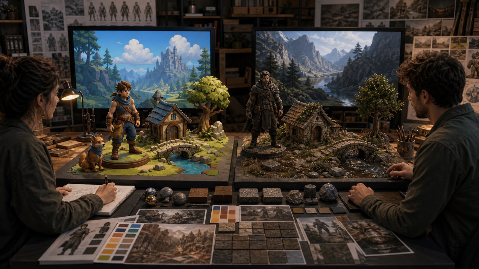
A stronger approach uses experience goals, audience research, and gameplay readability tests. Teams should compare the styles through playable tests, camera-distance screenshots, lighting studies, material samples, character readability checks, and performance budgets. This turns the decision from taste into evidence. It also reveals hybrid options, where the game uses realistic materials with simplified shapes or stylized color with grounded animation. Those tests make tradeoffs visible while the art direction is still flexible.
Understand What Stylization Really Means
Stylized 3D art direction matters because artists building expressive worlds need to choose a style that can survive real production, not only a beautiful pitch image. Stylized and realistic 3D art both have strengths, but neither is automatically easier, cheaper, or more immersive. The right choice depends on what players need to read, what the team can build consistently, and what kind of emotional promise the game is making. This is why style decisions should be tested in scenes, not only in mood boards.
The risk is that stylization becomes a vague excuse for inconsistent choices. A realistic direction can look impressive in early renders and then become expensive, stiff, or visually noisy in play. A stylized direction can look charming in concept art and then become inconsistent if the shape language, color rules, and materials are not clearly defined. Both styles fail when they are treated as labels instead of production systems. A team needs rules that guide ordinary assets, not only hero examples.
Know The Burden Of Realism
Realistic 3D art production matters because teams chasing believable worlds need to choose a style that can survive real production, not only a beautiful pitch image. Stylized and realistic 3D art both have strengths, but neither is automatically easier, cheaper, or more immersive. The right choice depends on what players need to read, what the team can build consistently, and what kind of emotional promise the game is making. This is why style decisions should be tested in scenes, not only in mood boards.
The risk is that realism creates expectations the pipeline cannot satisfy. A realistic direction can look impressive in early renders and then become expensive, stiff, or visually noisy in play. A stylized direction can look charming in concept art and then become inconsistent if the shape language, color rules, and materials are not clearly defined. Both styles fail when they are treated as labels instead of production systems. A team needs rules that guide ordinary assets, not only hero examples.
A stronger approach uses reference libraries, scan-quality targets, lighting studies, and animation checks. Teams should compare the styles through playable tests, camera-distance screenshots, lighting studies, material samples, character readability checks, and performance budgets. This turns the decision from taste into evidence. It also reveals hybrid options, where the game uses realistic materials with simplified shapes or stylized color with grounded animation. Those tests make tradeoffs visible while the art direction is still flexible.
Compare Readability At Gameplay Scale
Style readability in 3D games matters because designers and art directors need to choose a style that can survive real production, not only a beautiful pitch image. Stylized and realistic 3D art both have strengths, but neither is automatically easier, cheaper, or more immersive. The right choice depends on what players need to read, what the team can build consistently, and what kind of emotional promise the game is making. This is why style decisions should be tested in scenes, not only in mood boards.
The risk is that close-up beauty hides problems during real play. A realistic direction can look impressive in early renders and then become expensive, stiff, or visually noisy in play. A stylized direction can look charming in concept art and then become inconsistent if the shape language, color rules, and materials are not clearly defined. Both styles fail when they are treated as labels instead of production systems. A team needs rules that guide ordinary assets, not only hero examples.
Match Style To Platform Constraints
Platform-aware art direction matters because developers shipping across devices need to choose a style that can survive real production, not only a beautiful pitch image. Stylized and realistic 3D art both have strengths, but neither is automatically easier, cheaper, or more immersive. The right choice depends on what players need to read, what the team can build consistently, and what kind of emotional promise the game is making. This is why style decisions should be tested in scenes, not only in mood boards.
The risk is that the chosen look exceeds hardware or memory budgets. A realistic direction can look impressive in early renders and then become expensive, stiff, or visually noisy in play. A stylized direction can look charming in concept art and then become inconsistent if the shape language, color rules, and materials are not clearly defined. Both styles fail when they are treated as labels instead of production systems. A team needs rules that guide ordinary assets, not only hero examples.
A stronger approach uses target-device tests, shader budgets, and asset-density checks. Teams should compare the styles through playable tests, camera-distance screenshots, lighting studies, material samples, character readability checks, and performance budgets. This turns the decision from taste into evidence. It also reveals hybrid options, where the game uses realistic materials with simplified shapes or stylized color with grounded animation. Those tests make tradeoffs visible while the art direction is still flexible.
Consider How The Style Ages
Long-term visual identity matters because studios planning durable games need to choose a style that can survive real production, not only a beautiful pitch image. Stylized and realistic 3D art both have strengths, but neither is automatically easier, cheaper, or more immersive. The right choice depends on what players need to read, what the team can build consistently, and what kind of emotional promise the game is making. This is why style decisions should be tested in scenes, not only in mood boards.
The risk is that the art direction depends too heavily on current rendering trends. A realistic direction can look impressive in early renders and then become expensive, stiff, or visually noisy in play. A stylized direction can look charming in concept art and then become inconsistent if the shape language, color rules, and materials are not clearly defined. Both styles fail when they are treated as labels instead of production systems. A team needs rules that guide ordinary assets, not only hero examples.
Use Hybrid Styles Carefully
Stylized-realistic hybrid art matters because teams mixing visual languages need to choose a style that can survive real production, not only a beautiful pitch image. Stylized and realistic 3D art both have strengths, but neither is automatically easier, cheaper, or more immersive. The right choice depends on what players need to read, what the team can build consistently, and what kind of emotional promise the game is making. This is why style decisions should be tested in scenes, not only in mood boards.
The risk is that the game looks undecided instead of distinctive. A realistic direction can look impressive in early renders and then become expensive, stiff, or visually noisy in play. A stylized direction can look charming in concept art and then become inconsistent if the shape language, color rules, and materials are not clearly defined. Both styles fail when they are treated as labels instead of production systems. A team needs rules that guide ordinary assets, not only hero examples.
A stronger approach uses rules for what stays grounded and what becomes exaggerated. Teams should compare the styles through playable tests, camera-distance screenshots, lighting studies, material samples, character readability checks, and performance budgets. This turns the decision from taste into evidence. It also reveals hybrid options, where the game uses realistic materials with simplified shapes or stylized color with grounded animation. Those tests make tradeoffs visible while the art direction is still flexible.
Test The Production Pipeline
Art style workflow testing matters because producers and art leads need to choose a style that can survive real production, not only a beautiful pitch image. Stylized and realistic 3D art both have strengths, but neither is automatically easier, cheaper, or more immersive. The right choice depends on what players need to read, what the team can build consistently, and what kind of emotional promise the game is making. This is why style decisions should be tested in scenes, not only in mood boards.
The risk is that the approved style cannot be repeated by the team. A realistic direction can look impressive in early renders and then become expensive, stiff, or visually noisy in play. A stylized direction can look charming in concept art and then become inconsistent if the shape language, color rules, and materials are not clearly defined. Both styles fail when they are treated as labels instead of production systems. A team needs rules that guide ordinary assets, not only hero examples.
Choose The Style You Can Defend
Final style decision making matters because creative leads need to choose a style that can survive real production, not only a beautiful pitch image. Stylized and realistic 3D art both have strengths, but neither is automatically easier, cheaper, or more immersive. The right choice depends on what players need to read, what the team can build consistently, and what kind of emotional promise the game is making. This is why style decisions should be tested in scenes, not only in mood boards.
The risk is that style arguments stay subjective and circular. A realistic direction can look impressive in early renders and then become expensive, stiff, or visually noisy in play. A stylized direction can look charming in concept art and then become inconsistent if the shape language, color rules, and materials are not clearly defined. Both styles fail when they are treated as labels instead of production systems. A team needs rules that guide ordinary assets, not only hero examples.
A stronger approach uses evidence from gameplay, budget, audience, and team capability. Teams should compare the styles through playable tests, camera-distance screenshots, lighting studies, material samples, character readability checks, and performance budgets. This turns the decision from taste into evidence. It also reveals hybrid options, where the game uses realistic materials with simplified shapes or stylized color with grounded animation. Those tests make tradeoffs visible while the art direction is still flexible.